Progression of Version III
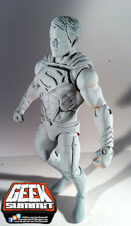
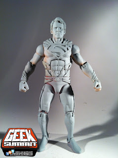
I started with the Mattel WWE figures this time. I figured the more realistic bodies would favor the film likeness better and the set up on the these torsos lead to much less complicated treatment on the ribbing and accents and really just all around were a better fit.
The hair, emblem base, cape top, and accents were sculpted on and a fist was ganked from another figure since apparently no wrestler comes with TWO FISTS.
Pretty decent start to the figure. The lower legs came from a DCSH Superman. The "Battle Damage" reissue version. What a crappy figure… I should cut off your legs!!
Primed with final sculpts to the lower legs and emblem.
Still looking pretty promising...
Missed a few spots but I didn't notice until I got it in to photograph… Not a problem.
duh Duh DUH!!!!!
The entire body is painted (light colors first and stay inside your lines) from head to toe…
The blue is again a mixed with a little yellow for a minor aqua tint but this blue really fought it out and stayed VERY blue.
All of the accents are painted a straight silver. I tried dry brushing but I was working from a spray can and I was really bringing a cannon to a knife fight.
After the silver dried I came back with a mixture of my original blue and a cup of water. I just glazed back over with a wet paint filled brush and just tried to leave a presence to take away from the stark silver.
The top of the cape is sculpted to a point in the back. There I flush cut it to a point where I will simply attach a fabric cape. I really think Mattel ought to look into this method. I've read about complications and cost with soft goods but really it adds so much to these figures and helps them balance so much more.
Cracked the Toupee of Steel towards the end of the project. It totally crumbled in my hands when I tried to pop the head off for detail painting… Lesson learned.
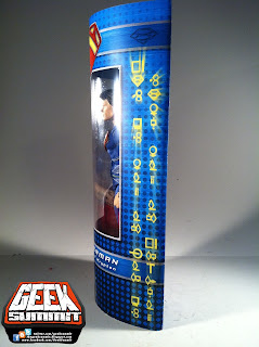
And now the packaging…
First of is the Bio for the back. Now I didn't really have to get too imaginative here but I did want it to read somewhat vaguely since there is a lot we don't know about the movie still. There were however, based to on the known cast of the film, bases to cover so we know what characters are introduced.
Textures used are a mix of brushed steel, color overlays and a color halftone gradient for that extra punch.
The emblem is completely hand done in illustrator and then treated in PhotoShop with textures and bevels and strokes and shadows and you name it… everything but Outer Glow.
And of course are my ever present Holy Trinity of Contact Info!!!
The front and back feature artwork by Daniel Morpheus found on DeviantArt.com. The second I saw this image I was like "WOW!! packaging art!!" so it was a natural choice. Daniel is credited fully for his artwork… I wouldn't want someone ganking something of mine which no doubt took time and skill and pass it off as their own. Luckily I have none of that.
This Kryptonian Scribble reads;"Kal El, Son of Jor El - Last Son of Krypton"
Its echoed again on the inside inset bookending the figure but really its not that prominent.
All in all what I love about this packaging is that it is so compact… I have been doing this format for a while for my more dedicated customs and what I find is that simply its sleek, durable, easy to manufacture, and can be easily theft proofed. On top of that you can fit like 50 of these on any shelf… or shopping cart... :)
So here we have it for the observing… GeekSummit's Prototype Suggestion for The Man of Steel; starring Henry Cavill. I know that is is in no way a prediction of how the movie packaging will turn out but I find it fun to put my foot out there in a 2 day push to see a product go from chunks to chiseled…
Thanks For Looking!!!


 //PART 2
No comments:
Post a Comment