Back with another installment on a steady theme here we are with version V of my figure series:
Movie Masters Classics | Superman the Movie
In this figure we take a little more time with the smaller details we well as rework some ideas that have been bouncing around in the old attic for a minute.
Of course we are skipping quite a few steps here but we can always circle back around on version VI someday soon.
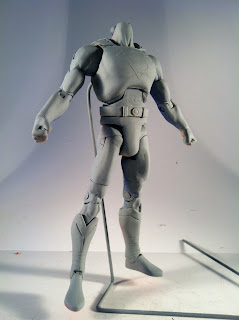
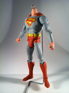
Anyway we take a DCUC Superman body and sculpt new boot tops to the added DC SuperHeroes Supes lower legs. They stand off the shin to give that added scale punch. The cape top is sculpted as well for total control of its appearance. The upper torso is also sculpted over to take away more of that comic book musculature.
The sculpted over upper torso also gives more of that "Reeve Ribcage" that protrudes in those first 2 movies. It also gives us a nice surface to attach our emblem pre-priming. Also we have enhanced the cod area to give a little anatomy to the square crotch we see on DCUC figures. It's functional but when doing a film accurate character, it has to be addressed. The belt has been flipped upside down to elongate the pelvic area and give more territory to the trunks as back in the 70's it was not a sin to wear your pants up to your navel.
We start off painting wit our bright colors so that overpaint with out darker colors doesn't become an issue… and really at this point, only blue is left, but its the principle. Since both the blues and reds and of course yellows are such bright tones we'd rather be careful to only get paint where it is needed.
The yellow is straight out of the bottle acrylic. It goes down first since its a secondary color where red is usually present and it perhaps give a little glow to the red once its down.
The red is a 90/10 mix of the same yellow and straight bottle red. It takes the red up a notch but not nearly to an orange but once the blue hits it can leave the red looking a little muddy if it is too red.
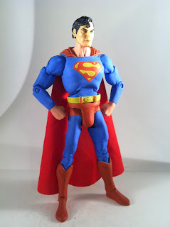
Now to the blue. I always mix way more than I need and I hate that since I end up wasting another half of everything I mix but I try to get my colors right by over estimation. The blue is a mix of a Cobalt blue and about a 20% white added. once stirred it almost takes on a green hazey quality but once it dries and layers it comes off as a very very bright blue.
Using the vinyl decal for the emblem really helps in defining that shape for painting. Its definitely almost cheating but its a great way to make sure your "S" keeps its identity. Its a very slight emboss but SUCH a helpful tool when it comes down to precision painting which is NOT my specialty.
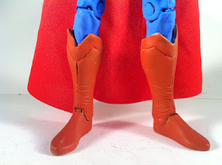
A detail shot of the boot tops shows the "stitch work" of the shins as well as the wrinkles around the ankles where all the action is. The V-cut tops are sculpted flat to the shins, cut to shape and then peeled back off of the leg to give them a little more scale and depth.
And here we are, the classic poster pose minus the American flag...
5/8 profile...
And contextual action pose with props...
The wrinkles are subtle on the boots but they do catch light pretty well and since they are not the most prominent feature they don't have to jump out at you but they make a nice addition of detail.
What's that I hear?
The McRib is BACK!!!!!!
up Up and AWAY!!!
And our obligatory watermarked saturated closer picture…


 //PART 2
No comments:
Post a Comment